


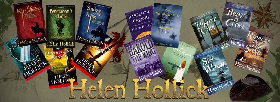
Cream hat, cream paper for historical novelist Helen Hollick
As self-published authors, we may be thankful for the creative freedom allowed by our independent status – but should we also use that freedom to depart from conventional publishing production standards? Historical novelist Helen Hollick thinks not. A debate about the choice of paper colour triggered this heartfelt plea for conformity.
A couple of days ago I had a ‘discussion’ with my Assistant Editor for the Historical Novel Society (HNS) Indie Reviews, Janis Pegrum Smith, about using white or cream paper for indie-published fiction, and then the same question arose on ALLi's Facebook forum, provoking quite a bit of interest and debate.
Janis proof-reads the reviews that are written for the indie historical fiction that is submitted to me for the HNS. She is also a talented author in her own right (watch out for her forthcoming first novel in a series The Book Ark), director of Wilton End Publishing, and runs a superb new blog for indie writers. She is a wonderful friend and ‘sensible advisor’ when I need sensible advice – but we recently disagreed about the use of white versus cream paper. You wouldn’t actually think that such a simple subject could initiate such hot feelings would you?
Raising Standards for Indie Authors
As HNS Indie Review Managing Editor, I am striving to improve the quality of indie-written historical fiction, and I maintain that for authors to be taken seriously they have to produce professional quality books. (Let’s face it, there are still a lot of people out there who remain disparaging about “Vanity Publishing”.) That means indie books should match traditional mainstream standards:
- professional editing
- rigorous proof reading
- good cover design (again preferably professional)
- high standard layout of the book itself
This last point means:
- not using 8pt font, Comic Sans or italics throughout
- nice straight margins – not left or right justified, and not too wide or too narrow
- no double or 1.5 line spacing
- no ‘widows’ or ‘orphans’ – single lines or words on a page, usually at the end of a chapter
- the author’s name and book title should be on the spine and front cover (I have had a couple of books submitted without this – one author said that as she was mostly selling online she didn’t see the point of putting a title on her book cover!)
None of these examples of ‘incorrect’ layout give that essential professional ‘feel’ to a book.
The Paper Debate: White or Cream?
Helen Hollick's books are trade published in the USA and indie-published for the rest of the world
The majority of mainstream fiction is printed on cream paper. Why? Because it is easier on the eye. White paper can cause a glare (and even headaches) which can inhibit or ruin the reading experience. And we don’t want that do we?
Or do we?
Janis pointed out that not all printers offer cream paper, only white; that white can look crisp and clean and – a point that did make me think – as indie writers should we not have the freedom to do what we want and be different?
This is very true; the one huge advantage of being an Indie author is that we are in control of the book we produce. We can do it our way. But there is a but…
Independence – with Professional Standards
Does this mean that poorly produced books, with some of the flaws I mention above, should be acceptable? Left justified text is OK because the author likes it that way? The entire narrative in italics or Comic Sans (that taboo font) because it is different to the norm?
There is nothing wrong with ‘being different’ – if that is what you want. By all means use your own ideas BUT (well I said there was a but….) but if, as an author you want to be regarded as good as mainstream. If you want to be up there alongside the mainstream authors, to be respected as a serious ‘mainstream quality’ writer, to receive good reviews, and maybe even awards, then yes, you do have to do it the mainstream way.
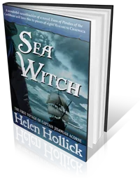
Trade-published or indie? Helen Hollick is both – and consistently professional.
Anything else – while not saying it is incorrect – isn’t accepted as appearing professional.
How many of us would like to drive on the wrong side of the road? Not have to stand in a regulated queue; would prefer to drink our tea or coffee out of the saucer instead of the cup? Most of us I suspect, but we toe the line because it is the accepted, respectable way of doing things or the tried and tested safe and better way.
To finally rid indie of that vanity publishing label we must, as authors, prove ourselves as every bit as good as (if not better than!) mainstream. And to do so, mainstream standards should apply.
Or do you disagree? Should indie mean indie to the very bottom of the line where anything and everything goes?
Join the conversation by leaving a comment!
Helen Hollick has been instrumental in the introduction of a new HNS award for indie authors, presented for the first time earlier this month. More news to follow on this blog later in the week.
 EASY TWEET

“Cream paper or white for #fiction? Why it really matters for #indie authors: by @HelenHollick via @IndieAuthorALLi: https://selfpublishingadvice.org/standards/”
I agree with the most salient parts of your column, in terms of professional appearance. I do have one issue however: I am about to publish my first non-fiction. I have hired professional editors for my previous two novels and, in general, I accepted their suggestions and did appreciate their ability to edit my copy down from, say, 500 pages to 300 without losing the essence of the story and even improving the readability for those readers who are less experienced at reading a complicated story.
Conversely, I have gone through two editors for this non-fiction and fired both of them. This manuscript is written from deep within me; it has a particular and tenacious story and, while I’ve made every attempt to provide a civil discourse, it has an agenda that will not be diluted by misguided and malignant editors who are concerned about political correctness with regards to the readers sensibilities. So, I have chosen to self-edit. i am a meticulous person, but will probably miss some things. So be it.
“To finally rid indie of that vanity publishing label we must, as authors, prove ourselves as every bit as good as (if not better than!) mainstream. And to do so, mainstream standards should apply.”
How can we be better than mainstream if we apply the same standards they do?
I follow only about 85% of what mainstream does because I strive to be better. I use white paper only when pictures are involved. Otherwise, cream paper is much easier on the eyes, and when reading a 130,000-word fantasy novel, I want easy on the eyes.
Historically books were on cream paper because it was cheap paper that had not been bleached, not because there had been research to show it was the best for reading. Sadly, the cream offered by Createspace does not look anything like the cheap quality of traditional paperbacks that yellow and age over the course of time. It is a cream version of the white paper option.
Is it right that Indies can only compete by looking as cheap as their mass market counterparts? Aspiring to mediocrity rather goes against the grain. Black writing on a white background is easier to read, unless in bright sunlight and even then it will depend on the finish of the paper as much as the background colour.
I tried a cream paper from Createspace and concluded it looked so ‘fake’ as to appear more ‘self-published’ than using white paper.
We need to acknowledge the paper used for short run and print on demand is a different quality and will appear different whichever colour we choose.
Many thanks for this, Helen,
I was instinctively veering to cream but hadn’t realised this was only available on certain trim sizes. Luckily it was an easy change to a new trim for my very lovely book production company (HeadandHeart). I can imagine lots of new authors getting caught out at the point and plowing on with white as it’s the only option put up for their chosen trim.
I found this column because I googled “why is paper so white in self published books?”. When the paper is blindingly white it is a dead giveaway to me that the book is self published. I have recently read books in three different mystery series with very professional looking covers and type but with very white pages – in one book the pages were so white they seemed blue. I don’t know if it is harder on the eyes but it is very distracting and it is all I can think about as I begin the book.
As an aside, I am also very aware of type and I hate italics for more than a page and a half. As a reader, I don’t need the type to change when the narrator or time period changes – just a title heading is enough. Type changes and unusual layout can also be very distracting and detract from the story.
its really informative tutorial. Thank you for this tutorial .
I accidentally ordered white for the proof copy of my book and that seems to me to have a cleaner, crisper look than the cream used by CreateSpace – which looks beige to me. Not everyone sees colour the same way – or maybe different batches of paper come out slightly different colours.
We don’t want bright white. Cream is preferable in theory, but in practice the cream in both CS and Ingram Spark is too too cream.
Cream is not pale yellow or pale beige. You should be able to imagine it as something ready to pour on your strawberries. Let cream be cream, not khaki.
Meanwhile, I’ll have to continue with white.
Rosalind (et al)–
This is exactly the problem I have had with my two CreateSpace projects. Looking over the fiction titles on my shelf, none of them sport pages which veer into the yellow range the way CreateSpace “cream” does. To me, it looks goofy and unprofessional. I mean, how hard would it be for the CreateSpace people to just pick up some trade paperback novels and LOOK at the paper! They would find that, as you note, trade novels are generally printed on off-white, or you might say, a grayed white stock. I spoke to someone at CreateSpace about this a short time ago, and was (of course) told that that’s the way they do it (i.e., take it or leave it). Very frustrating. Along with others here, I find that the stark white is too bright: it also does not mimic the look of trade paperbacks published by major publishers.
In short, is anyone aware of any POD service that offers a “grayed” white paper, rather than this yellow stuff????
Best,
W.E. (Bill) Smith
Helen, as an Indie author who wants to create as professional image as possible, I am always glad to read advice from authors of your calibre. My first few books missed one or two of these points, but since I have read your book, Discovering The Diamond, I am attempting to be as mainstream as I am able in the presentation of my books, and I am grateful for each piece of information I find. I missed the option to choose cream paper last time, but it won’t be happening again. And I hope that, from now, each of my books will be as indistinguishable as possible from those produced by mainstream authors. Thanks so much for the time you take to give advice to those of us who are just at the beginning of what we hope will be the start of something – if not big – satisfying.
Thanks for posting. This is an interesting debate. Will tweet.
Sigh… This article implies that only traditionally published authors are the beat all get all authorities on higher standards of publishing thereby implying as well that ALL self published MUST aspire to lower standards of quality standards of writing. I assure you that not ALL traditionally published authors produce high quality work nor do all self published authors. Seriously, the trads do NOT hold the market corner on standards of quality work. I am self published and I do not need a trad to tell me what makes a quality write. therefore I do not feel that I am shunning standards of publishing by not holding on the the standards that never belonged to them exclusively.
I have a very unpopular opinion, but I’ll share it anyway.
I prefer black text on WHITE paper. I have trouble reading black text on cream paper, especially if it’s Garamond smaller than 12-pt. I need the sharp contrast of black on white. Black text, especially the more compressed Garamond authors are fond of, tends to fade into the cream paper.
That aside, as my hubby pointed out, the cream paper that Createspace uses looks like it’s been peed on. *G* It’s not the same color as the ivory that many trad publishers use, which resembles newsprint, more toward the gray than yellow. Depending on the font used, that can be difficult to read, too. I’ve had comments from readers that my books are very easy to read compared to other books they buy, so I figure I’ll stick with what works for me. 🙂
I use full-justification in my books, but I’ve seen trad pubbed books with ragged right margins. I tend to read it as though it were a manuscript (thus, I CRIT it instead of just read), but readers that I’ve chatted with about those books haven’t seemed to care either way.
Very interesting post! I actually went with white paper because with my cover art on CreateSpace, the off-white looked positively yellow and the font didn’t show up as well. I would be interested on your take on glossy versus matte covers via CreateSpace. I do appreciate your sharing and I’ll say that in the year since I’ve released God’s Daughter, I have gone back and fully justified the margins (vs left-justified). I have seen traditionally published fiction with ragged edges in softcover, but I do like the fully justified look better (although spacing can be a bit odd at times between the words). Thanks for sharing, Helen!
[…] No, I don’t want to read your self-published book. And Why Indie Authors Must Meet Professional Production Standards – Including Cream Paper for Fiction! […]
I agree that in 99% of cases it needs to be cream paper for fiction – but there are exceptions. The Costa Award winning children’s book Goth Girl is printed on white paper – and it really works.
It’s a quirky book and the bright white pages add to the quirkiness – and work well with the black and white illustrations.
You can see it on my author site blog, where I reviewed it (link below). As I type there are no shots of the interior there but I will add some shortly for the benefit of anyone looking there – but even if you get there too soon you will see from the existing photos that it’s a book with a difference! >> http://wellsaidpress.wordpress.com/childrens-book-reviews/goth-girl-book-review/
Browsing through children’s bookshops you do occasionally find other graphic novel chapter books that use white paper – thought the majority don’t.
On that note, I recently had to make a difficult decision on paper colour with my latest children’s book, Henry Haynes and the Great Escape where for the first time ever I used CreateSpace’s UK channel for Amazon distribution. (I normally use Lightening Source for Amazon UK & worldwide distribution and CreateSpace for Amazon.com – with the same ISBN. I changed my tactics this time as I wanted to avoid the ‘Out of stock’ messages at launch which inevitably occur on Amazon UK for the first week or two if using LS.)
When I received the proofs from CreateSpace the so called ‘cream’ paper looked terrible – way too yellow; as if I’d picked an old Penguin Classic off my mother’s bookshelf! I handed it around to visitors all of whom had the same reaction. The book looked second hand!
Oddly, when I compared the paper colour with that of ‘Life Form Three’ by Roz Morris which I had recently bought and could see was printed by the same UK printers for CS the paper colours matched – but Life Form Three looked fine and not ‘second hand’ or too yellow at all….!
Henry Haynes and the Great Escape is a chapter book for ages 6-8 and I think it was the effect of the larger type size, slightly wider spacing between lines and the inclusion of black and white & grayscale illustrations that somehow rendered the effect too yellow. Kind of an optical illusion – but a very real one!
I therefore went ahead and ordered a sample in white paper and got views from trusted parents. I personally find it very bright but the consensus from parents was the white won over the yellow and was/is fine – and so I’ve gone with that for my Amazon online orders.
This all said, I’ve stuck with cream paper for my Lightning Source copies which I order for myself and sell at school events and supply to local bookshops, and which are distributed in the UK and globally via LS (except to Amazon.) The LS cream paper is so much closer to white – and this ultimately looks best.
The fact that Goth Girl has white pages, as do some other graphic novels for children makes me feel that my approach is okay – but as a rule I’d always go for cream!
[…] Should indie authors conform with the trade? | Self-Publishing Advice https://selfpublishingadvice.org/standards/ […]
Cream paper, and the highest standard is our motto. We’ve spent a year researching cover designs by traditionally published peers, fonts, illustrations, layout and design; everything you can research, we covered it!
Helen, I’m with you all the way, not only in support of cream paper, but in all the points you make about layout. I’m very fussy about this and like my indie published books to look as professional as my books which were published by Random House. In fact, I think my (professionally designed) covers are even better.
If other indie authors want to experiment with quirky layouts, white paper, weird covers, then it’s up to them, but I won’t be joining them. As a fanatical reader since I was three, perhaps I’ve been brain-washed as to how a book should look, but I treasure beautifully produced books. I want mine to be beautiful too.
On the white vs. cream issue, I agree with others who have commented here about white computer screens. I find I suffer from eye strain from using the computer much sooner than I do reading a book with cream paper.
Yes, I do think we are sometimes brain-washed into how books should look. However, it does seem that, whatever paper colour one chooses, the layout, etc really does need to be done well if you want to publish professionally.
I also find white computer screens hard on the eye – I usually find decreasing the brightness helps quite a bit. The book equivalent, of course, would be cream paper! I’m just glad books aren’t written with various-coloured backgrounds like in some magazines as I just can’t read them under my night-light.
There is a wonderful book called the Chicago Manual of Style. It is the style guide for the publishing industry. It will answer a lot of questions.
Isn’t it interesting the book with the best production value usually has the best content. Making books requires a view of the big picture and the smallest details. It is not an either/or situation. You spend months on a MS and an editor can start spotting weaknesses in it within a few minutes. Have you ever thought why?
Unfortunately, creative choices are thought of as a matter of opinion. They are not. They are a matter of skill and experience. We will not compete with traditional publishers because we are “professional,” but when we can equal their skill and experience.
Have just got the paperback copies of my second novel – admit I had to check but yes, the paper is definitely cream and it looks professional. I agree with Debbie (above): white has the feel of a textbook. Black on white: open a novel and it ‘feels; amateur because we are soused to black on cream (hence my having to check!)
I also think good cover design helps sell Indie books – steering between what the trade is using and something too eccentric or esoteric isn’t that easy, but is worth it.
On website and their white backgrounds. my eyes get very strained reading on screen.
In answer to your question: yes and no. When I started thinking about how my first novel would look, I made a careful survey of my genre, historical fiction, paying particular attention to novels about the late 19th century but not neglecting novels about other eras. When I met with my designer (who had designed art books before, but not novels) I came prepared with a stack of books (trad and indie) to show him what I wanted. And yes, when it came to paper we decided on cream because that was what most of the other books used.
But since I was in control of the project, I felt free to do things that weren’t usually done. I wanted a pregnant late 19th century woman on the cover, which I had never seen before. I agreed with the designer that we should leave the header (my name or book title) on the first page of a chapter, because publishers are inconsistent about this anyway and there was no logical reason (other than convention) for leaving it off. We made some mistakes, the designer and I, but we didn’t follow every convention slavishly and I’m glad about it. The point of employing a good designer is to let them do their job and be innovative and creative.
By the way, have you noticed that textbooks and websites (two environments where you’d think they’d want to help out our eyes) use white backgrounds? I do find myself wondering whether this “cream is easier on the eyes” notion is based on any real customer preference, or is just a convention hallowed by time. It used to be a lot more difficult to produce white paper…
And what about the different conventions between countries? Have you noticed that books produced in the UK tend to be a different format from books produced in the US? And that different types of novel often have different formats? Must we opt for trade paperback size, or (if, for example, we write historical romances) would we be better off going for mass market paperback layout?
So yes, following the conventions is a useful way to gain acceptance in the mainstream book world but no, expecting indie authors to conform strictly to a set of production standards may be neither feasible nor fair. As a reviewer I’ll always put content over form, even though if it came to judging between two similar books in terms of writing, the best produced book will win.
I went through Createspace and chose cream as it was recommended. I also saw it in books on the shelf at my favorite indie store. Since my books are there now (and selling out –very cool) It looks just any of the best designed books there, whether facing out and on spine side. I want the reader to pick up a book that is a well designed product as well as a great read.
Considering the point as an avid reader, I tend to expect black print on white paper to be didactic and instructional (therefore non-fiction) but black on cream to be more relaxing (therefore fiction). Whether that’s because I’ve been conditioned into it by decades of reading commercially published books, I’m not sure! Interesting that my Kindle is a Paperwhite and not a Papercream though – I wonder why?
Very interesting. My first reaction was a scream of horror, but the point is a very sensible one:
“but if, as an author you want to be regarded as good as mainstream. If you want to be up there alongside the mainstream authors, to be respected as a serious ‘mainstream quality’ writer, to receive good reviews, and maybe even awards, then yes, you do have to do it the mainstream way.”
That is absolutely right. Where I would qualify it is by saying that as indies it is our right not to wish to be those things as much as it is our right to wish to be them, and that any indie-friendly group MUST respect and reflect those indies and their aspirations who decide they do not want to conform just as they respect and reflect those who decide they do.
Cream all the way for fiction for me. Not only do I like it as a writer, I love it as a reader. And what readers think matters the most in this instance. They are the ones buying the product.
With you all the way!
For people with a partial site disability and for those short-dighted like me who wear glasses/contacts, black on yellow provides the clearest contrast for the eye/brain. Now, yellow would be daft for books, but cream is nearer than white. I read a lot at night and find white too glaring for fiction.
Have tweeted.
I once met a lady who had done a degree in typography (I think that was the name of it). This was a few years ago now, but back then, she told me Comic Sans was the best font for things like dyslexia (no serifs, simple look to it, etc). Ironically, this is the font which is so often lambasted in professional circles.
Thanks for posting this Debbie – I look forward to reading some comments and views!
I agree with cream paper for fiction; when Createspace started offering cream, I tested it and was immediately thrilled with how much more professional my print books looked.
But I don’t advocate that just because “it’s good to conform”. Blind conformity is never a good idea, either.
I think cream is best for (most?) fiction because it provides a better experience for the reader. Aside from their expectations, the reduced contrast is actually easier on the eye, allowing the reader to more easily drop into a story.
It’s ok to conform if you have good reasons to do so, even if you’re one of us rebel indie types. 😉
Agreed – blind conformity not good… and I’m not saying that to blindly conform, BTW! 😉
I used cream paper with one of my non-fiction books (The Jacaranda Trail) and, as it’s set in past, it just felt right to use this colour paper. However, for my other books, I felt cream would be kind of ‘dull’.
I would like to think we could all find a happy medium, somewhere between professionalism and following your own instinct.